Architects,
like all professions, have their own language and tricks of the trade
which, like all professions, allow them to charge more that they're
often worth. Like the Magic Circle I don't think I'm supposed to
tell anyone about the tricks but I've now resigned from the RIBA so
sod it. One trick all Architects learn is that, to create a “Wow”
factor, you have to ignore at least one, and preferably more, of the
rules of sensible design. Think about it – tick every box and your
design looks like thousands of previous versions. Everyone has seen
it before so it can't help being a bit boring. This particular Fred
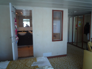
Olsen Bathroom is spacious, luxurious and it definitely has the Wow
factor. Underneath the surface, almost invisible to the untrained
eye, it's all a little bit silly.
To
set the scene our cabin is on the top accommodation block right in
the centre of the really big suites. It's proof that all those
hours Janet spends pouring over cruise ship plans on the Internet
have not been wasted. We have the same frontage as the biggest
suites but ours isn't as deep to allow space for the swimming pool on
the deck above. That means that our layout is turned 90 degrees to
the usual cruise ship cabin plan with spectacular results. The side
of our bed and our living area are alongside a glass wall which opens
to a balcony that's big enough for a deck quoits. The inner part of
the suite has our wardrobes, our entrance door and of course the Fred
Olsen Multiple Occupancy Bathroom.
I've
already mentioned the two windows in the wall above the bath. Even
the most ardent exhibitionist needs some personal time and so the
windows are fitted with Venetian blinds. In this position damage is
inevitable so, unless you want a peek-a-boo effect, opening and
closing the blinds means having to adjust bent or twisted slats. I'm
guessing that after the first day most people leave them closed. The
bath is enormous. Janet doesn't like our 6ft bath at home because
she says she can't brace herself properly but, moving rapidly on, -
this length of this bath is over 7ft!.
A
bath of this size is really for two people but in this case your
partner needs to have curvature of the spine to avoid the taps and
shower fitting. (Architects don't like central taps which sooner or
later will break when used as hand grips or end up scalding someone’s
genitals) The only way two people can use this bath comfortably is
if one has a shower whilst the other one lies down to bathe. Various
positions are possible but all of them are really only suitable for
the young or the extremely short sighted.
The
central part of the bathroom has two “his” and “hers” basins.
I've never been convinced about the usefulness of this arrangement
and the problem is there just isn't enough data. “Do you go to the
bathroom with your partner?” is a question that seldom gets asked
outside of certain Internet chat rooms. The truth is that two basins
tend to get used when the space looks too big for one. They also
subliminally say “These days everyone's got one of everything –
you've done so well you deserve two” (see also kitchen ovens) You
can always use the second basin to soak your underwear in overnight
but this does detract from the air of luxury the redundant fitting
is intended to create.
The
toilet is discreetly positioned behind a thin frosty perspex door
with gaps at the top and bottom. Seeing your partner sat on the loo
in soft focus is obviously preferable to the pin sharp version but
it's still not high on my bucket list. Also I don't want to be
indelicate but there's no way to avoid the subject of noise and
smells - aspects of life that are not entirely under control within
Fred Olsen's demographic. It goes without saying that the ceiling
extract is on the opposite side of the room to get rid of the damp
air from the shower. I'm afraid that sharing this bathroom is not
guaranteed to be a romantic experience for most of the meat eating
population.
So
there you have it – The Fred Olsen Bathroom. It breaks enough
rules to qualify for the Wow factor and It's large enough to
accommodate five people in luxury - as long as the two in the bath
and the two washing their hands can manage to ignore the one in the
loo.
Dave

No comments:
Post a Comment